PERSONAL PROJECT · MOBILE APP · 2026


A personal planner that shows you the moment a plan breaks, then rebuilds the day in one tap.
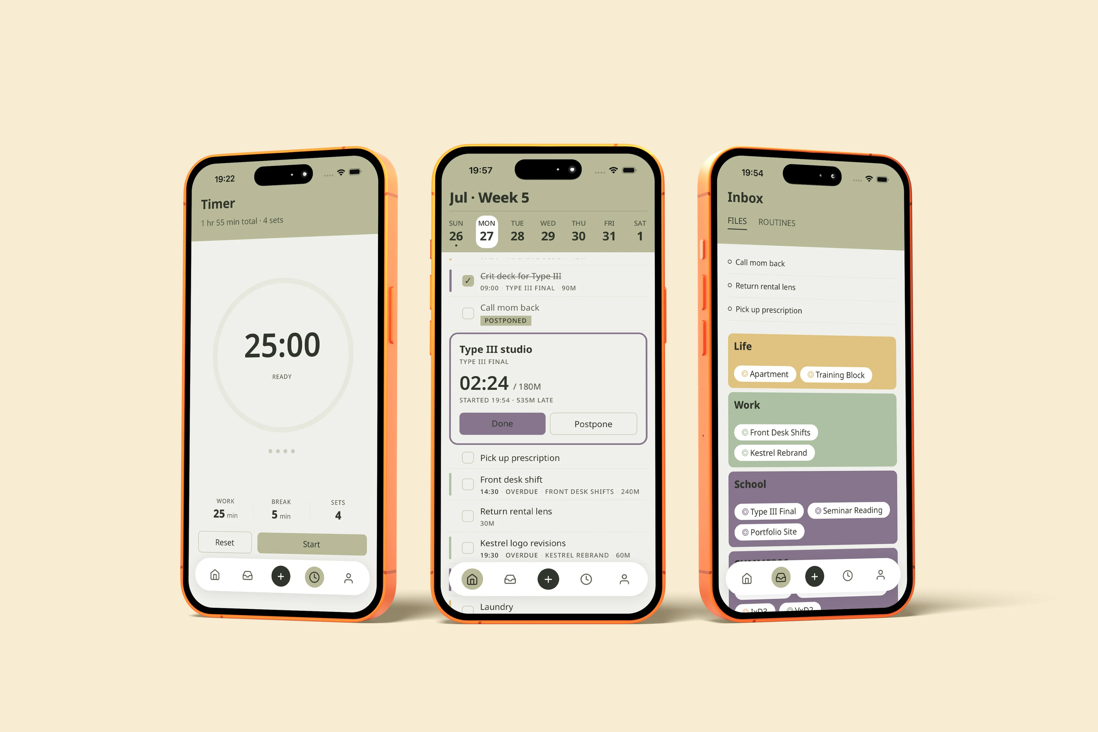
OVERVIEW
One disruption shouldn’t cost three days.
When one task runs long, everything after it becomes wrong. atrio treats that moment as the product.
WHAT IT’S FOR
Getting through a day with no room in it. atrio holds the work that has to happen today and keeps it workable when something runs long.
WHY TASKS, NOT A CALENDAR
A calendar tells you when you’re busy. It can’t help when a plan breaks, because events don’t move. What breaks is the work between them, and fixed commitments are treated as walls here, not as content.
WHAT IT ISN’T
Not a calendar replacement or a habit coach, and nothing in it is shared.
PROBLEM
Plan cascade failure
No slack anywhere in the day. One task past its slot invalidates everything behind it, and the repair takes days.
WHO
Class, a shift, errands and a workout in one day, and all of it has to happen.
WHAT
One task runs long and everything after it becomes wrong.
WHEN
Mid-day, several times a week. The ripple takes days to settle.
WHERE
Inside whatever planner they use, which now only shows what is broken.
USER JOURNEY MAP — ONE TUESDAY
07:30
Plan set
09:00
First task starts
10:30
Runs over
14:30
Everything behind is wrong
+2 days
Still repairing
WHAT HAPPENS
Run, crit deck, studio, shift, two errands, client revisions, reading. It all fits, with nothing spare.
Begins the crit deck. Estimated 90 minutes, due before studio at 11:00.
The deck isn’t finished. Studio is fixed at 11:00 and cannot move.
Shift starts. The lens return, the client revisions and the reading have nowhere left to sit.
The same four tasks get re-planned across the rest of the week, displacing that week’s work.
WHAT SHE THINKS
“Tight, but it works.”
“Done by 10:30.”
“Stop now, or show up unprepared?”
“I’ll sort it out tonight.”
“Why plan at all.”
atrio enters at 10:30, not at 21:00. Everything after the break is consequence, and none of it can be repaired by reviewing the day once it is over.
PRINCIPLES
Three rules the interface is not allowed to break.
All three rules exist to keep the app from blaming the person using it. Showing a broken day is easy; showing it without implying failure is not.
01
An unfinished task is not a failure
It stays where it was and goes quiet. No red, no strikethrough, no tally. The app says it moved to tomorrow, because that is what happened.
Rules out: streaks, completion percentages, red on anything that simply didn’t happen.
02
Nothing is marked late before it is late
Everything behind a running-over task is technically at risk, and the app says nothing. Later tasks look normal until they are actually affected.
Rules out: cascading warnings and “at risk” states.
03
One colour means trouble, and it is almost never on screen
A single deep red, called clay, appears on one thing: the count-up on a task past its estimate while you watch it happen.
Rules out: clay anywhere but a live overrun.
FEATURES
What the app actually does
Everything exists to shorten the distance between “my plan just broke” and “my plan works again.”
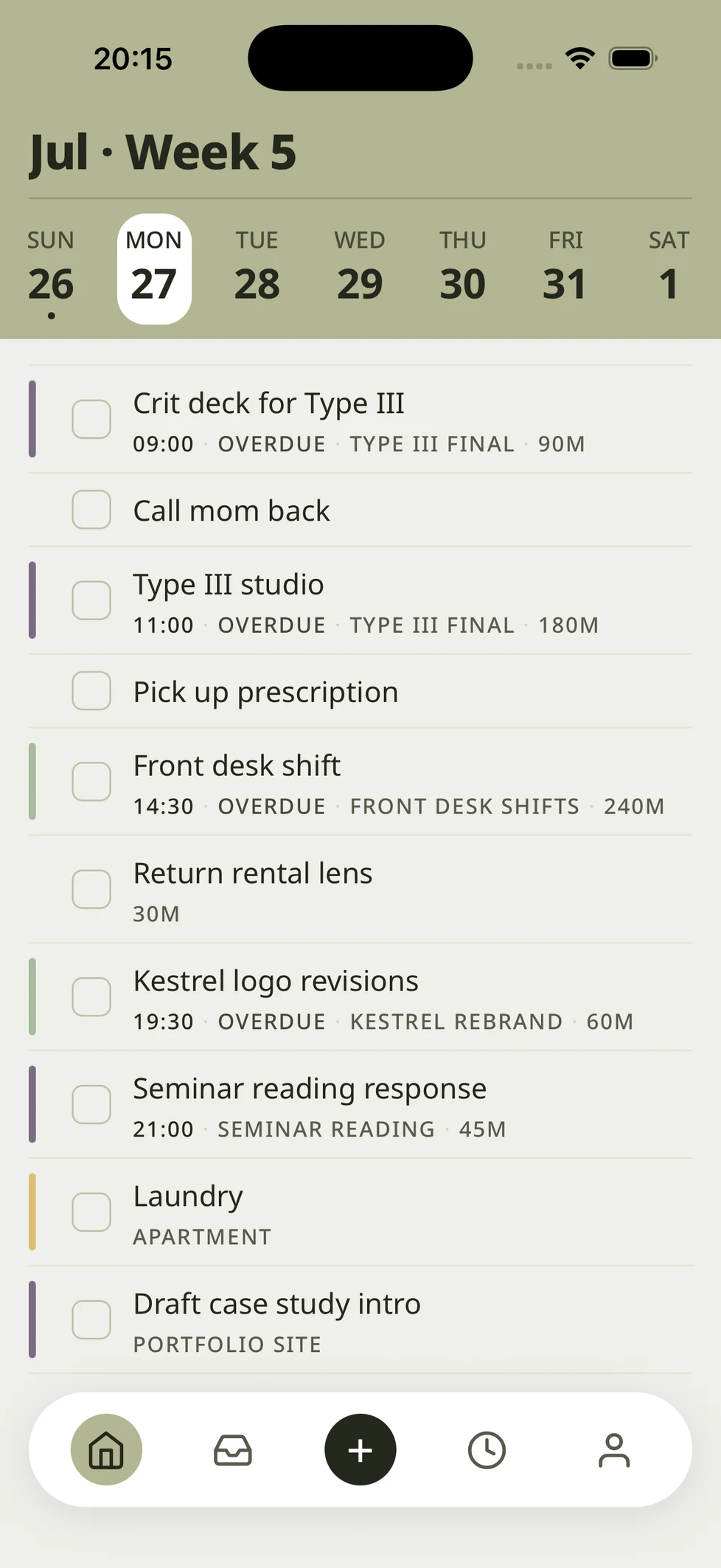
01
Organize
Area → Project → Task, both parent links optional.
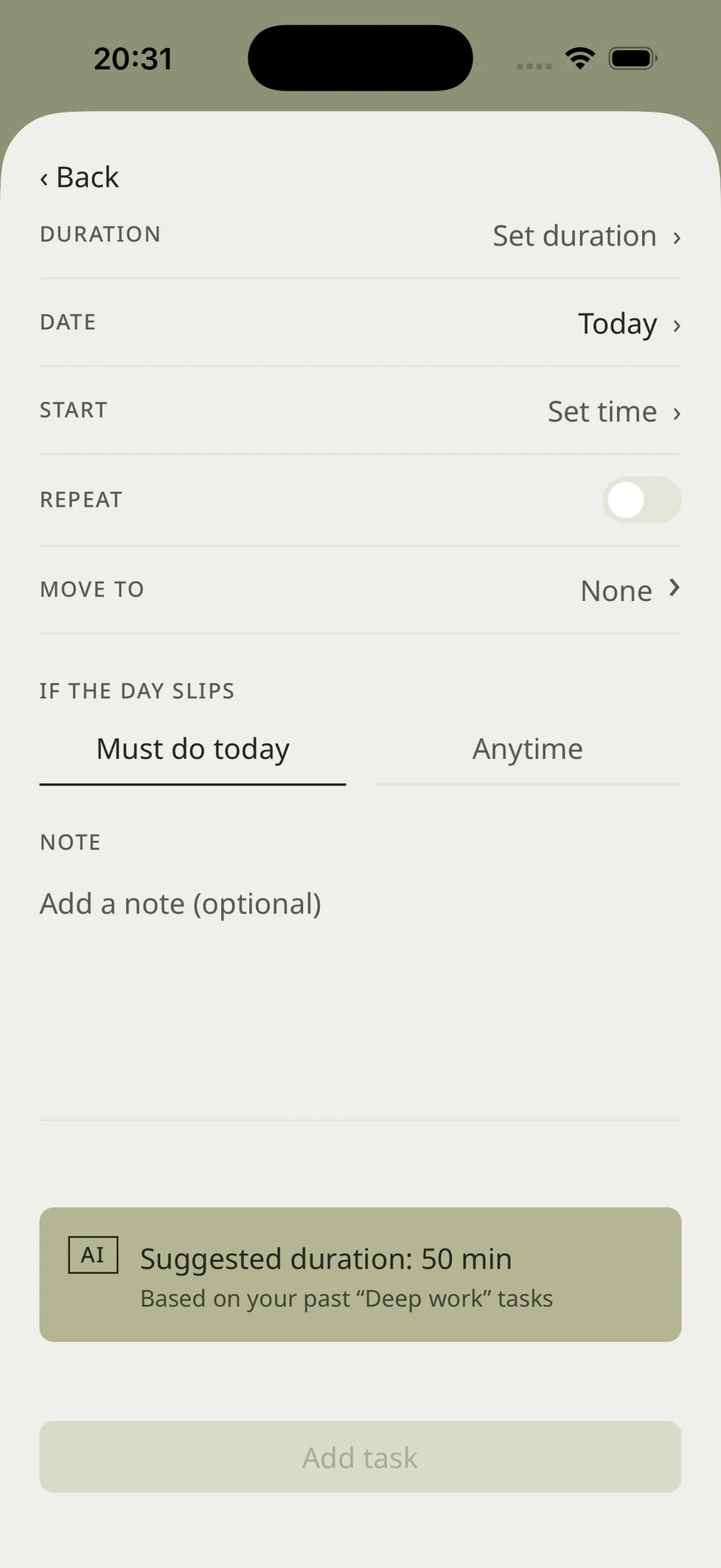
02
Estimate
Every task carries an estimate; the app records the actual.
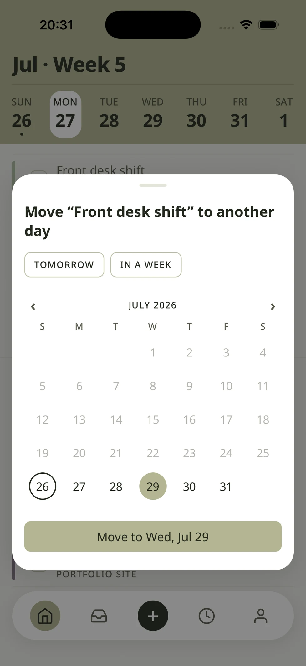
03
Reschedule
Fixed commitments hold; everything else moves around them.
FREE
Manual control + disruption made visible
You see the break, and you have the controls to fix it yourself.
PAID — AI
Proactive estimates + one-tap auto-reschedule
One confident plan showing only what changed. Accept, or adjust.
ALSO SHIPPED
- Today calendar strip
- Week paging, fixed weekday columns
- Schedule blocks
- Occupied stretches rendered as blocks
- Routines & recurrence
- Template and instance, next occurrence only
- Pomodoro timer
- Wall-clock deadlines, accurate in background
- Local notifications
- Scheduled through Notifications
- Drag reordering
- Untimed tasks placed between timed ones
- End of day + feedback
- Done / Ran over / Moved, plus a feeling
- Onboarding & coach marks
- Runs on sample data, re-previewable
USER JOURNEY
The flow, start to finish
Plan the day, watch it run, catch the break, rebuild, close without judgment. Today · Inbox · + · Timer · Profile.
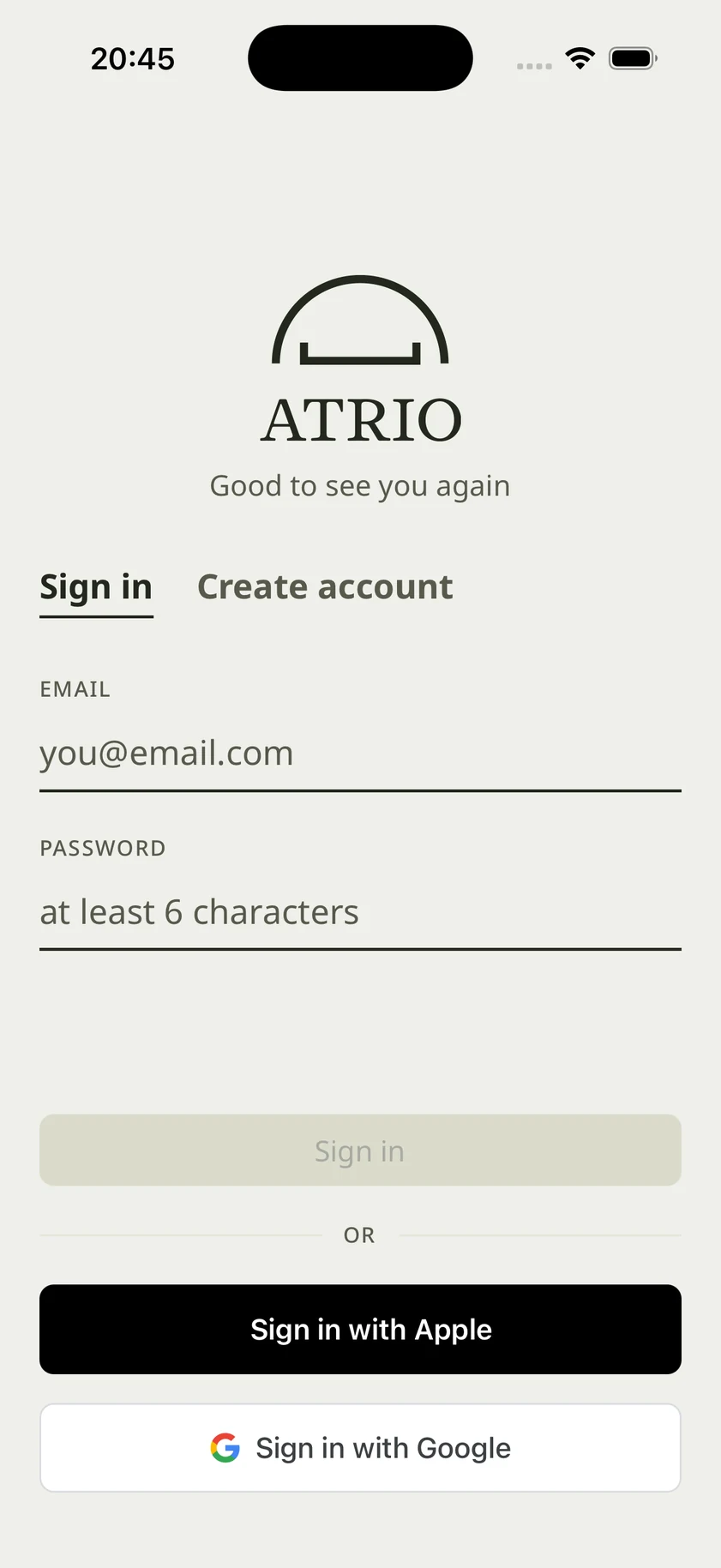
01
Log in → Goal setting
Motivation before structure.
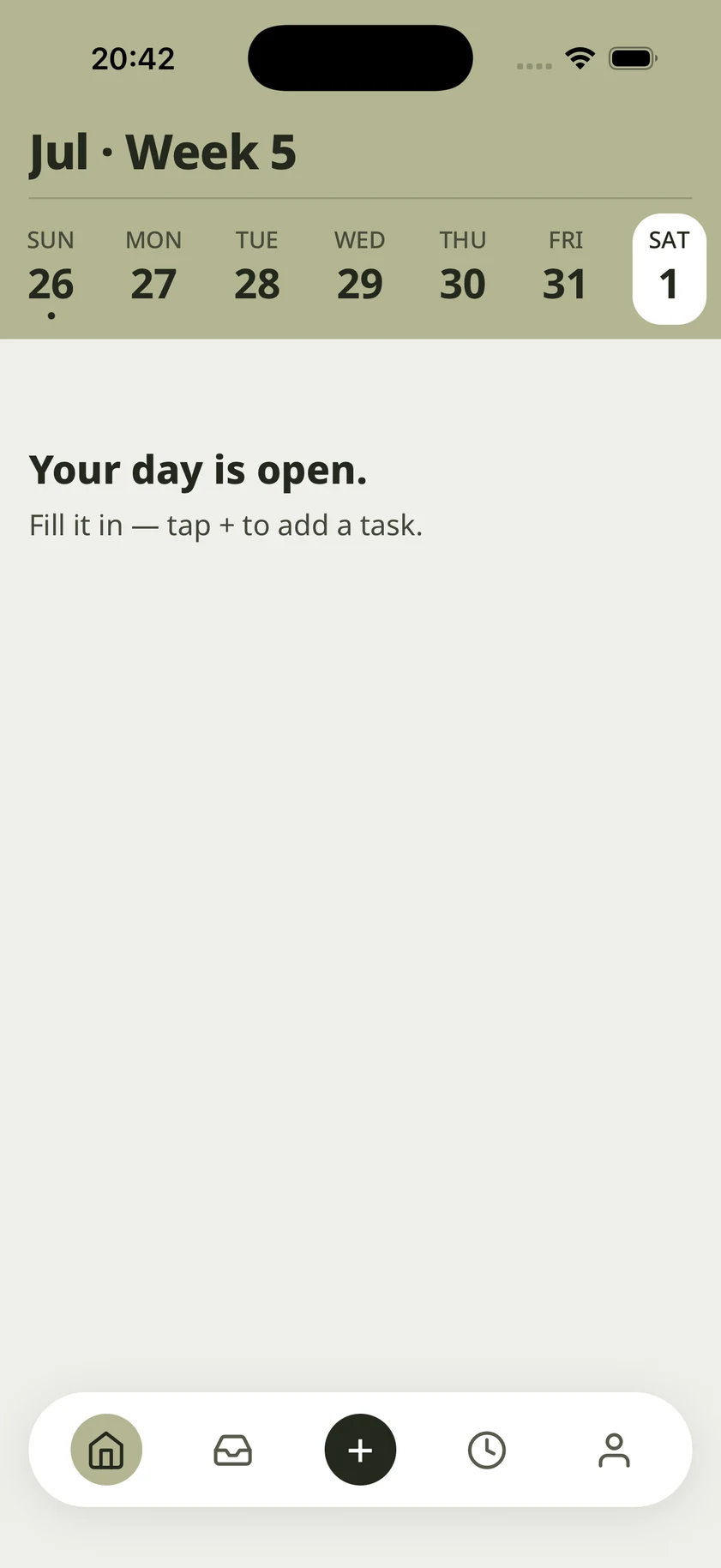
02
Today
Date-led. Timed and untimed tasks in one flat list.
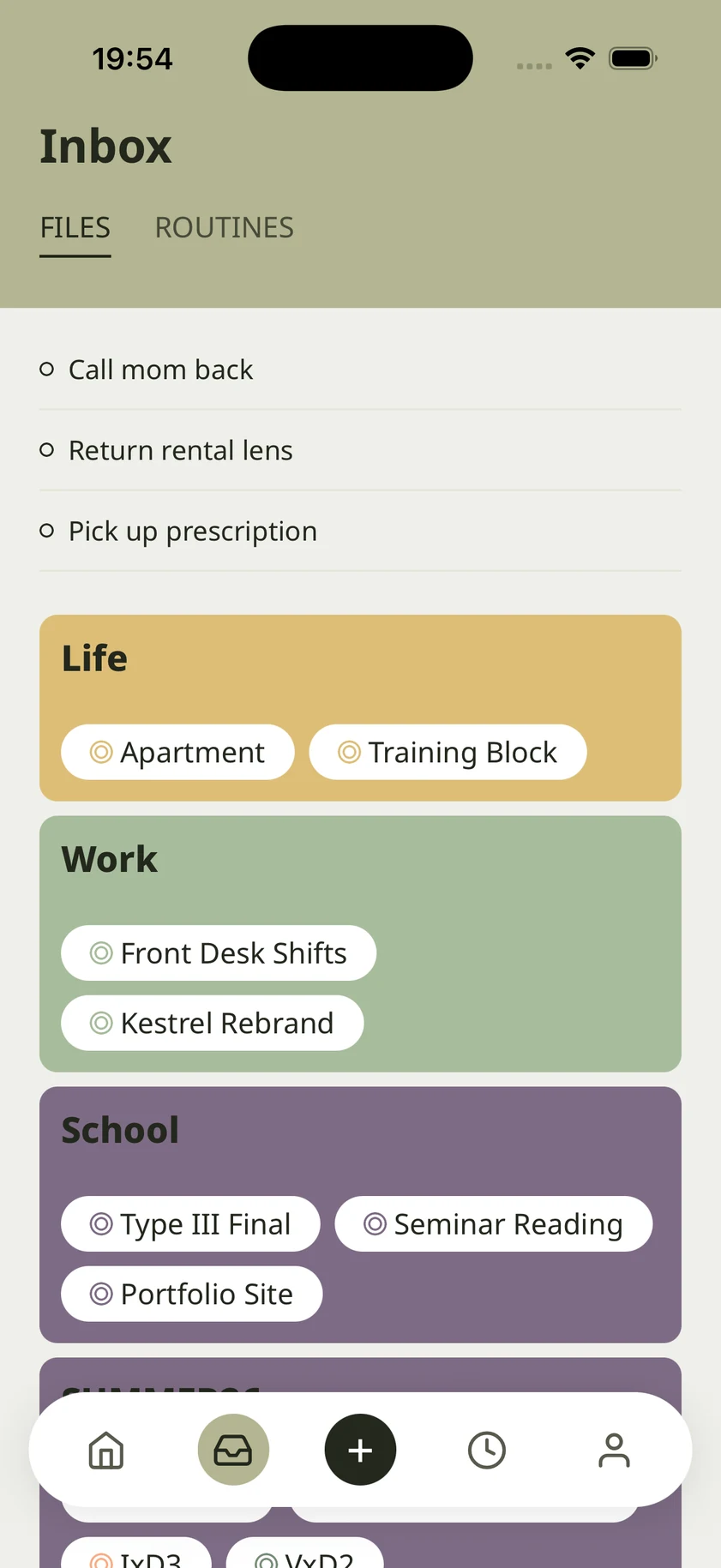
03
Inbox
Area as folder, project as file.
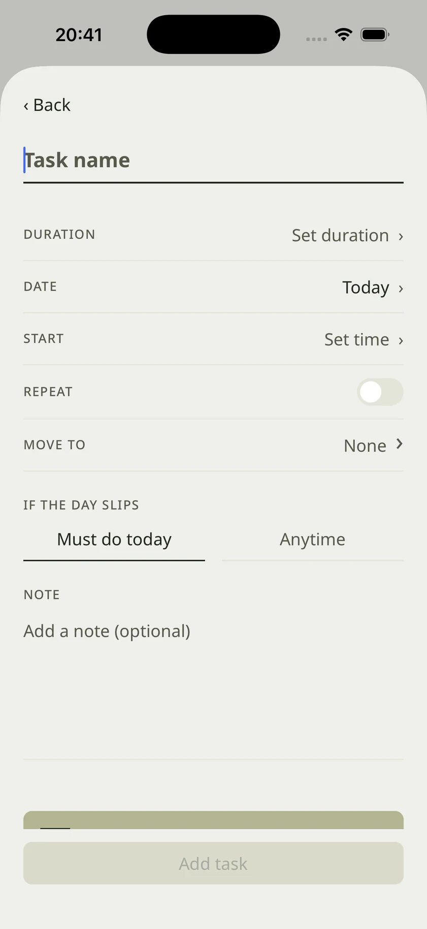
04
Make task
Duration, start, fixed toggle, deferability.
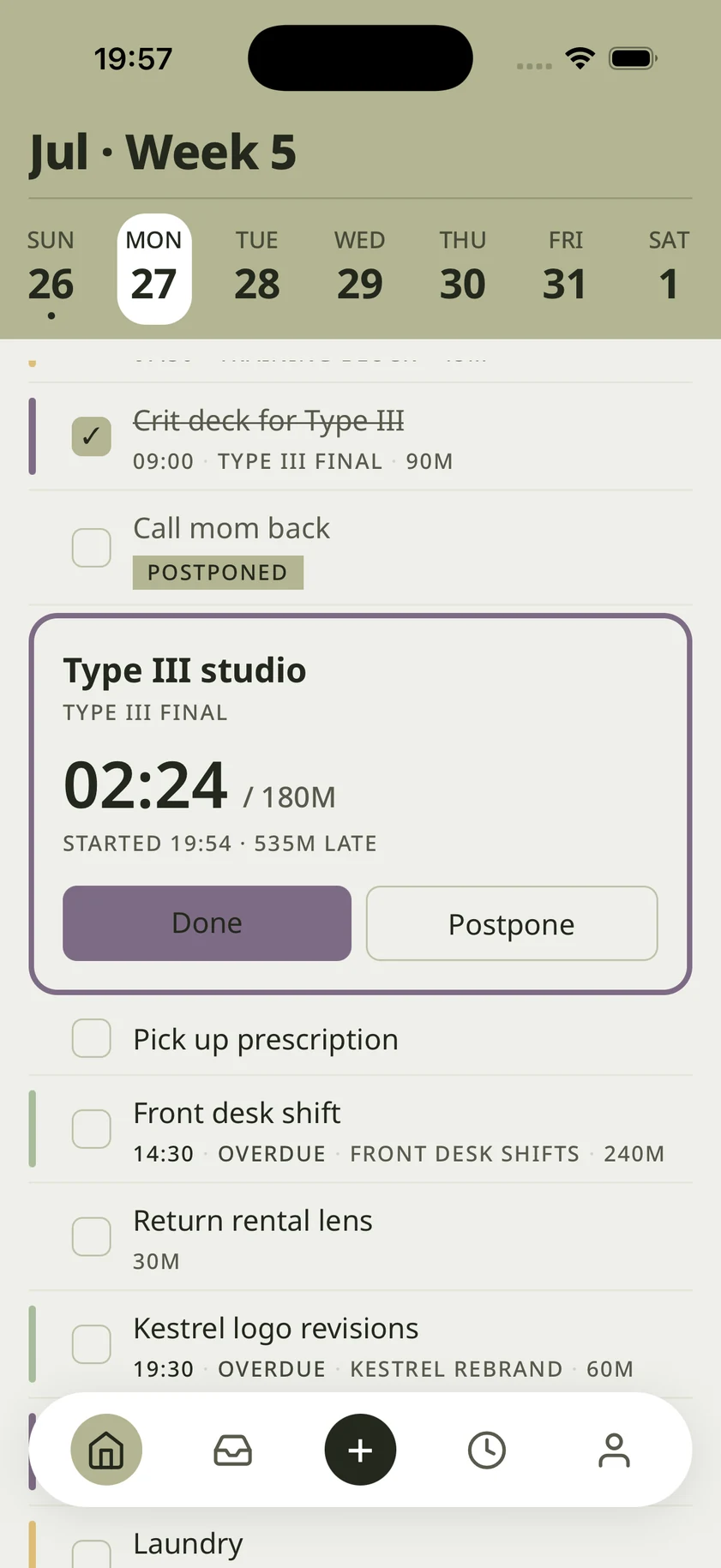
05
During task
Large timer, progress dots, Next.
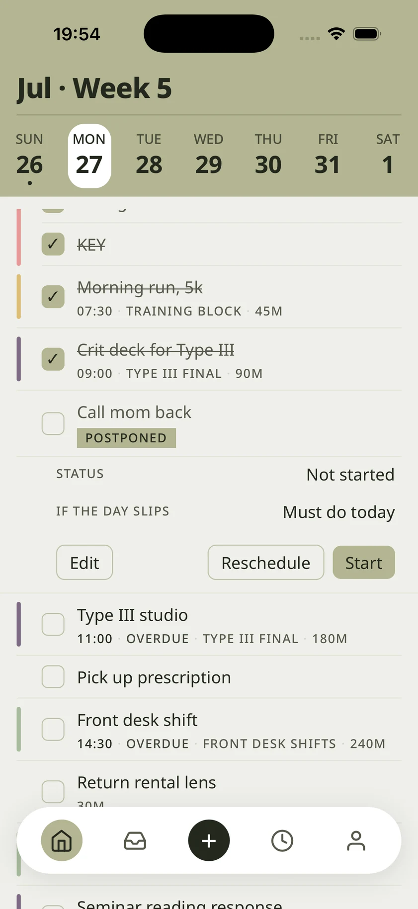
06
Task pending
Clay count-up takes the lead.
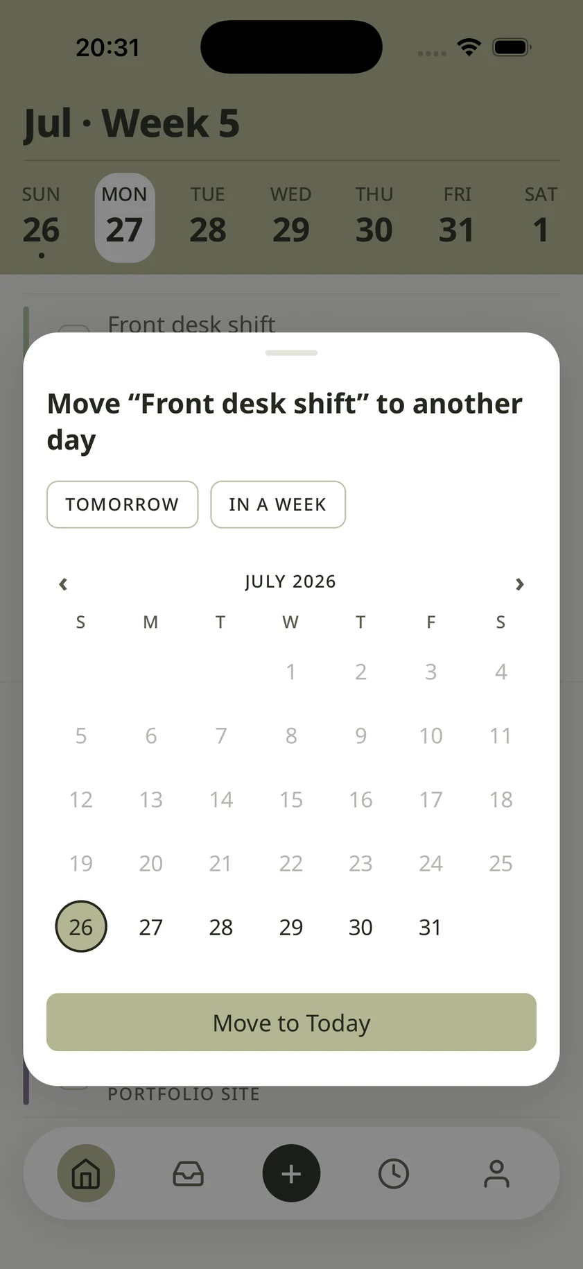
07
Reschedule
Auto, manual, or push everything back.
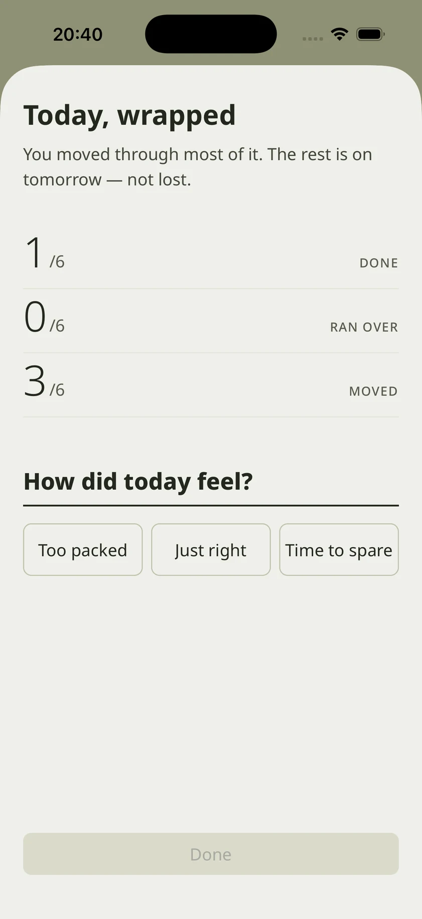
08
End of day
Numerals and a three-point feeling.
DESIGN SYSTEM
Botanical Sage
Neutrals carry the interface, sage handles interaction, clay handles collapse. All of it lives in one file.
PALETTE — FOUR THAT DO THE WORK
bg
#EFEFEA
Paper. Almost every surface.
ink
#23281D
Green charcoal, never black. All text.
primary
#B3B591
Sage. Interaction only.
danger
#C62828
Clay. Live overrun only.
Paper, leaf, stem, dried clay. Nothing is fully saturated, which is why clay registers the one moment it appears.
AREA COLOURS — CHOSEN BY THE USER
Twelve options for area colour, all held at the same low saturation so no area outshouts another.
#7B6C83
#B2A8C4
#9F707D
#DC9C99
#D48769
#F0AF8A
#DDBE95
#D2BCAB
#D8BF80
#C5C0A0
#ABBB9F
#7B8D7A
TYPE SCALE — INTER, TABULAR FIGURES ALWAYS ON
- Hero numeral
- +02:14
- Screen title
- Today, wrapped
- Section
- This afternoon
- Card
- Studio critique prep
- Body
- Moved to tomorrow, 9:30
- Label
- IN PROGRESS
40 / 46 · Semi Bold
26 · Semi Bold
21 · Semi Bold
18 · Medium
15 · Regular
11 · Medium
STRUCTURAL RULES
Alignment, not boxes
22px gutter, whitespace, hairlines. No cards, no shadows.
Numbers are first-class
Tabular figures always on. Large numerals carry character.
Cards only on OS surfaces
Sheets and overlays only. Never in-app screens.
Motion without overshoot
withTiming only. Transitions and nav pill share 240ms.
COMPONENTS
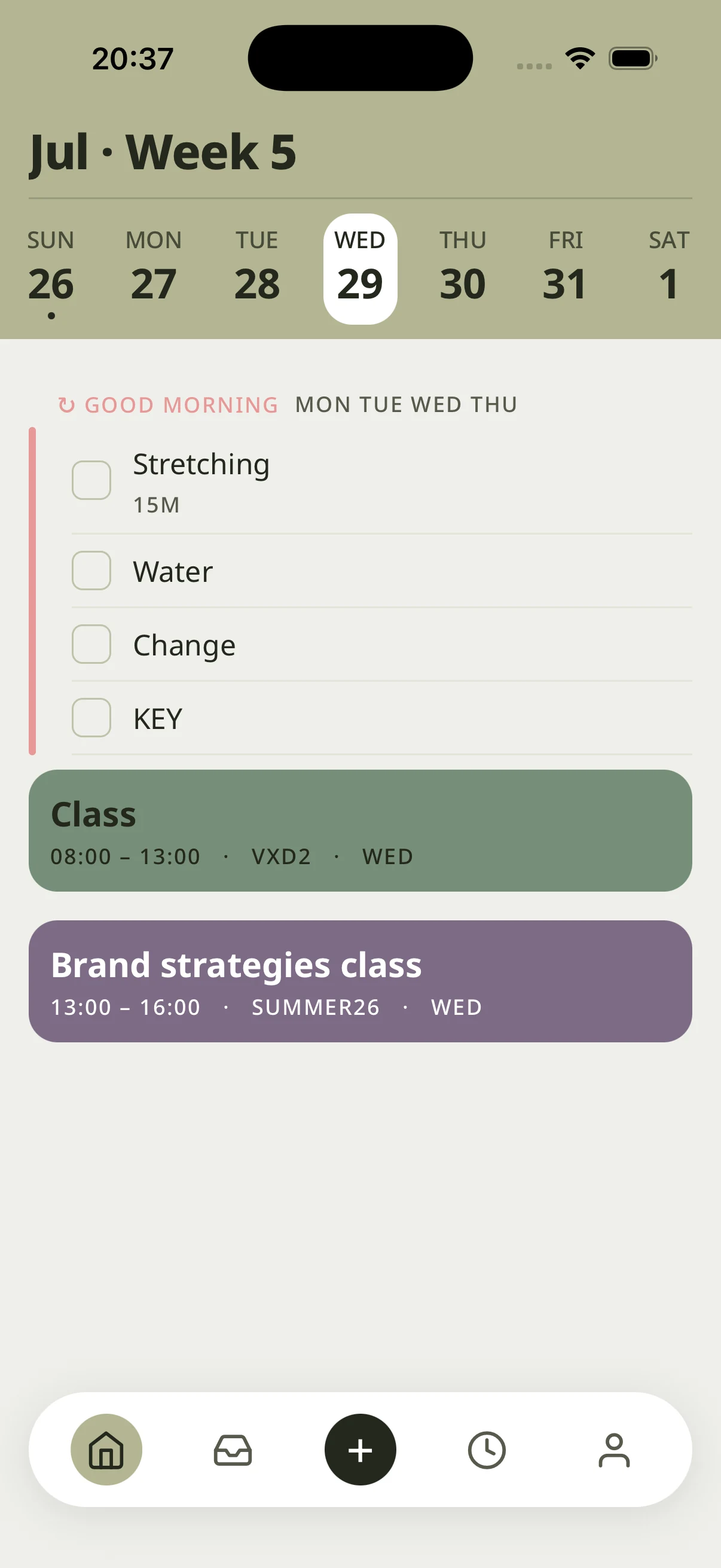
Nav island
Floating pill, five slots, sage marker.
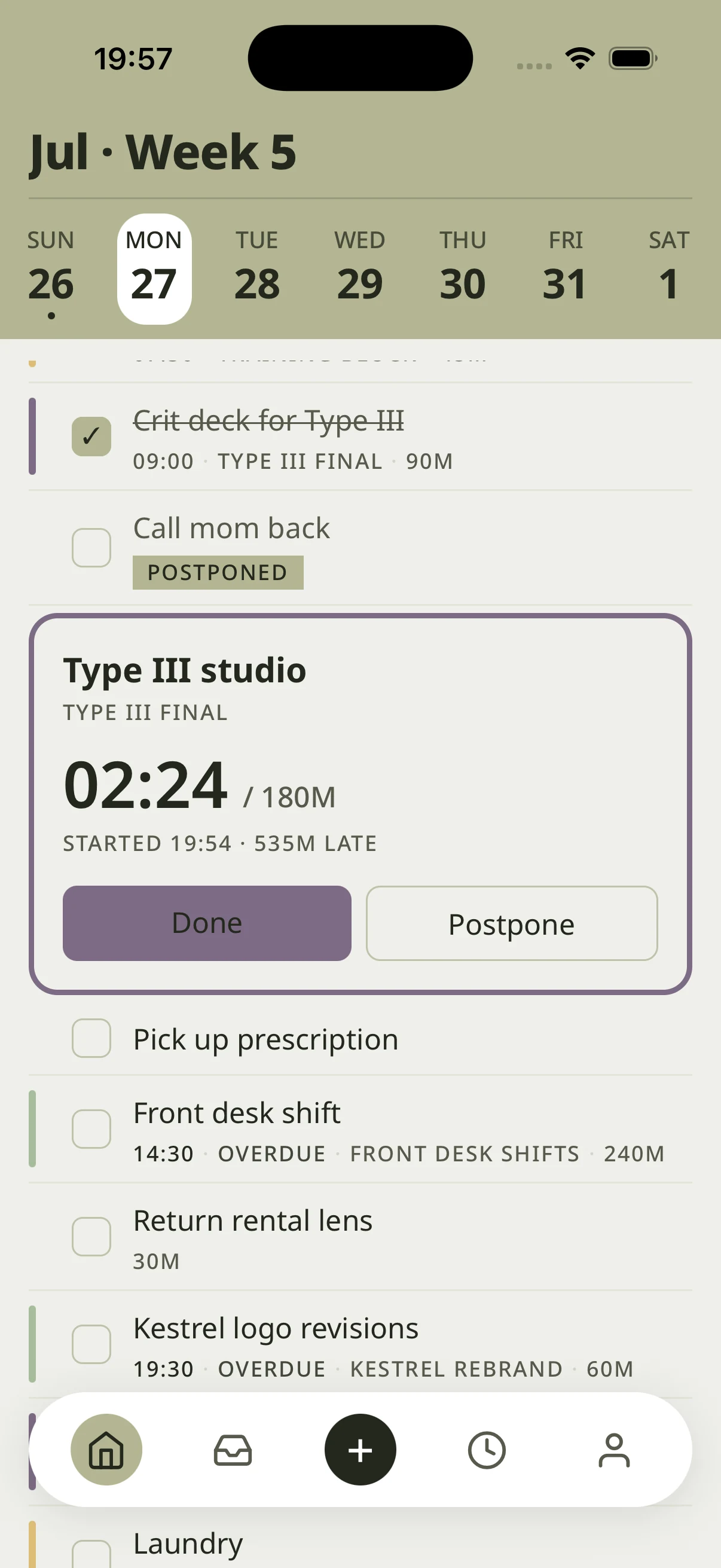
In-progress band
Full-bleed, live clock, clay past estimate.
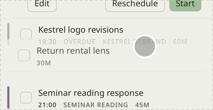
Change row
old → new, muted to ink.
CLOSING
What I would defend, and what I would change.
It started as a course assignment about a problem I had every week. It became the project where I learned that holding one rule steady beats any individual screen.
WHAT HELD UP
Scoping to the instant of disruption. It kept the project from becoming a habit coach.
One plan instead of a menu. Options during a collapse just add to the pile.
Restricting clay to live collapse. A warning colour stops working once it turns up somewhere ordinary.
WHAT I WOULD CHANGE
I settled the structure before the disruption flow was real, so parts of it were built for the diagram rather than for the screen.
Estimation quality is the whole dependency, and I tested it last.